Applying a max-width when there’s no container
Recently, I had a situation where I needed to apply a max-width to content inside a container. The problem was that:
- the container itself had to fit the width of the larger layout, so it needed to be a lot wider than a comfortable line length
- the text wasn’t contained in an inner container, so there wasn’t an element that I could just apply
max-widthto.
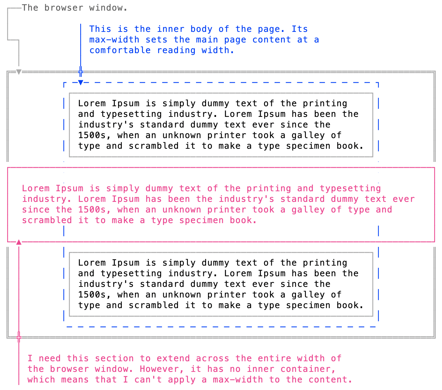
There’s a trick I’ve used before for situations like this, though: using padding to simulate a max-width. Basically, just add padding on either side to constrain the text to an ideal line-length.

If the width of the container element doesn’t change, it’s pretty easy to calculate how much padding you’d need on either side. The problem, of course, is that most layouts aren’t fixed-width any more; they’re fluid. Even if they stop getting wider past a certain point, their widths will still change at narrower viewport widths. So I can’t just calculate the padding once; I have to make sure that no matter what the width of the container element is, the width of the content remains constant.
The first thing I tried was this:
padding: 1em calc((100% - 75ch) / 2);Broken down:
100%is the width of the viewport: the window if you’re on a desktop machine, the screen if you’re on a mobile device.
75chis the width of 75 characters. That’s the max-width I want. The most comfortable line length is somewhere between 60-75 characters per line—anything above that requires the reader’s eyes to do more work scanning each line. That’s not a good reading experience. (I’m looking at you, Wikipedia)
If you look into the ideal line length, you’ll get a variety of answers. Matthew Butterick suggests a width between 45–90 characters; the Baymard Institute specifies 50–60; Robert Bringhurst suggests 45–75. I’ve been doing this a while, and in my experience, there isn’t any one number that works for every situation—I typically set it to whatever looks good. In this specific case, 75ch looked good to me, although the technique I’m describing works with any line length.
So basically, we’re specifying top and bottom padding of 1em, and side padding of whatever space there is when you subtract the ideal paragraph width from the overall width of the viewport. Since the padding is going to be placed on either side of the text, we’re dividing that value by two.
And that works nicely—until the screen gets really narrow, and the content presses up against it.
Because, of course, the width of 75ch—which is a fixed value, 75 characters per line—is now wider than the width of the viewport. Large value subtracted from small value = negative value. That’s going to look awkward on a phone. It would be nice to have some padding there, but how?
The quickest solution would be to use a media query to simply hide the max-width padding from smaller viewport sizes. That requires more code, though. Also, if you’re using a set of specific media queries—small, medium, large—the point at which the type hits the edge might not match any of them, so you’d have to either set up a whole new query, or hardcode that particular value into the CSS. Both are more complicated than the idea solution, which would be that the side padding never goes below, say, 1em (or however much you want).
Well, we could try something like:
padding: 1em calc(((100% - 75ch) / 2) + 1em);In theory, that’s adding 1em of padding to whatever calc((100% - 75ch) / 2) evaluates to. But what happens if—as will happen at very narrow screen sizes—((100% - 75ch) / 2) evaluates to a negative number? If that negative number is a lot less than 1em, wouldn’t that counter the additional 1em padding, and leave us back to the content up against the edges?
As far as padding is concerned, that shouldn’t happen—padding can’t be negative. Indeed, if you check the Chrome inspector, negative values passed to padding are adjusted to 0.

So if we’re operating under the assumption that there can be no negative padding in CSS and negative calc() expressions evaluate to zero, the math in the above should work. As long as 75ch is smaller than 100%—i.e. narrower than the screen width— we’ve got our max-width effect. When 75ch is wider than the screen width, calc(((100% - 75ch) / 2) + 1em) resolves to calc((0) + 1em)…or 1em padding, which is what we want.
Note that if you plug calc(((0) / 2) + 1em) into the inspector, you’ll get an invalid property value error. That’s because of types. Zero can’t just be zero, it has to be zero something: percent, ems, px, etc. If the expression was calc(((0%) / 2) + 1em), it would work.
But here’s the weird part. That doesn’t work.
This is where I don’t fully understand what’s happening. calc(((0%) + 1em) should always produce 1em. The results we’re getting—the text being right up against the edge of the element—suggest the scenario I mentioned earlier: the value calc() returns is being treated as negative, even if Chrome isn’t registering it as such. That 1em looks like it’s being swallowed by a value a lot smaller than it is.
Regardless, what we do know is that at some point, our calc() statement is going to be less—maybe a lot less—than 1em. That’s where max() comes in.
max() is a neat little CSS function that returns the greater of two values. And whatever is happening behind the scenes, that’s all we really need to know: which is larger, the padding value we just calculated, or 1em?
Even neater, max() accepts calc() expressions as a value. So the following is valid CSS :
padding: 1em max(1em, calc((100% - 75ch) / 2));And that should do it.